• • • • •
1
Using Bézier curves to recreate an ancient logo

An ancient hand stencil found in a cave in Indonesia. Did these represent authorship or ownership? Are they the first logos? Retrieved 03/14/2018 from The Independent.
A video demo on using the pen tool and making a compound path (8:42)

Dwarkanath Jhala
SNHU student Dwarkanath Jhala designed this identity suite for himself based on his initials plus the number 9, which had significance for him. The resemblance of his logo/mark to Sanskrit and bindi mark (traditionally worn on the forehead in India) were intentional.

• • • • •
2
Using Bézier curves to create a tombstone typeface

Advanced Typography
Joey Angelo Cruz, Rick Loffredo, Louisa Martinez, Jonathan Mendez
Developing Tranqilina, a digital typeface from a local monument
In Advanced Typography, the class studied the inscriptional letterforms of local tombstones then made complete functional digital fonts. In this case, the hand-cut forms were playful and naive, and as there was a mix of upper and lower-case letters. A monalphabet was developed, with alternate characters. In designing this typeface, students discussed developing a regional style unique to Northern New Mexico. Everyone agreed that typography would be an essential part of that vernacular. This project became one of three case studies related to teaching typography presented to the University and College Design Association Education Summit held at Northern Illinois University.
Photograph of tombstone from near Wagon Mound New Mexico by Nancy Lieppe.
• • • • •
3
Illustrating textbook covers with type.
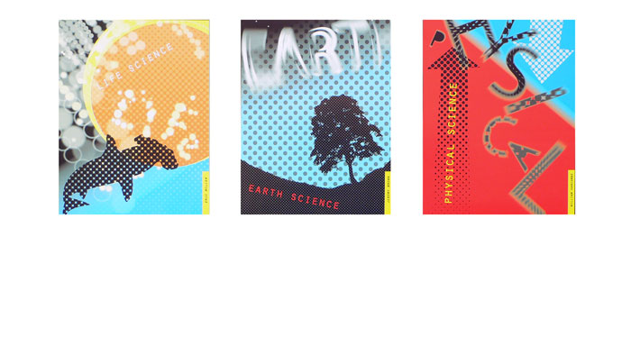
Type + Image
Roxenya Grevel
Textbook Covers for a High School Science Series.
In this project, an art director from a textbook publishing house critiqued the students’ work. Interior spreads were also developed.
• • • • •
4
Design Process
{Various Students Work}
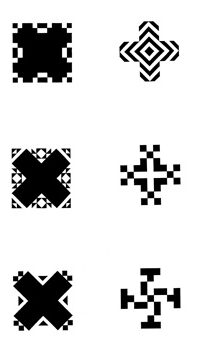
Additive/Subtractive Process Exercise
In this introductory course, students concentrate on process and learn to work through a progression. Using manual processes, students develop simple grid patterns, honing their sense of form and counterform. Too, the students used ink and paper, requiring a disciplined steady hand.
• • • • •
5
Design Process
Brock Kowalsky
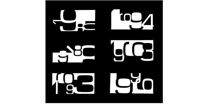
Progression Exercise
Using the more complex shapes of letters or numerals, students develop a series of compositions which can be read in a sequence. They are limited to black and white at this point, further increasing their sense of balance, field and figure. The computer has not yet been introduced, and the student must use pen-and-ink which improves manual skills and increases appreciation of the contour of letterforms.
• • • • •
6
Type + Image
Meredith Watson
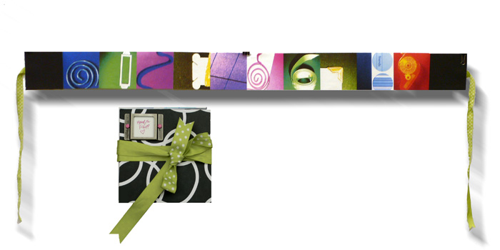
Letterforms in the Environment
The objectives of this assignment were to recognize the shapes of letterforms in the unexpected, document visual typographic investigation, develop a visual theme, and sequence images in book form.
• • • • •
7
Type + Image
Literal and Conceptual Type Portraits
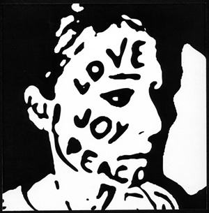
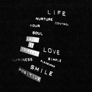
In this initial exercise, students explore relationships between type and image. The objectives include being able to see type as shape and gray value and distinguish between type as image, and combinations of imagery and type. Part 1 required the student to think of ways to describe their faces using black type. How can one create gray values using type? How can one suggest the topography of the face with type? Part 2 encourages the student to be less literal and think of more conceptual ways to describe themselves using type only. Type portrait by Katie Cawthon, conceptual portrait by Megan Grubb.
• • • • •
8
Type + Image
Jake Reddy
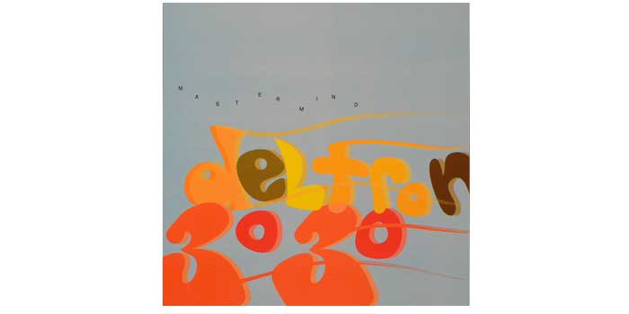
CD Jacket
In these experimental compositions (which use letterforms only) visual analogs between sound and typography are discovered/sensed. The square format unintentionally lent itself to CD covers, now a thing of the distant past.
• • • • •
9
Publication Design
Elliot Salazar
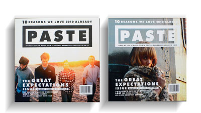
Magazine Redesign
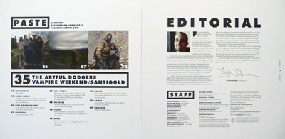
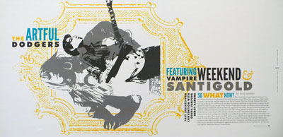
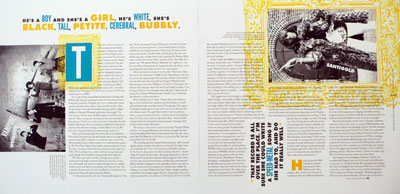
In a hypothetical redesign of an existing magazine, students use what they have learned in Type + Image and Typography classes. Here, the student has designed two alternate covers, a table of contents, an editorial opening spread and an example of extended text.
• • • • •
10
Type + Image
Melissa Lojewski
Dialog set to type
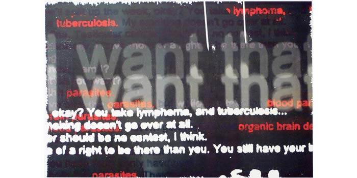
Here, the student recasts a dialog from literature, television or elsewhere in letterforms. Dialog from the movie Fightclub was interpreted in this composition.
• • • • •
11
Dialog set to type
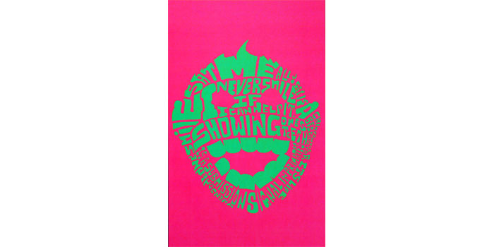
The dialog reads: “I never smile if I can help it. Showing one’s teeth is a submission signal in primates…” (from TBS The Office)
• • • • •
12
Type + Image
Reed Tomes
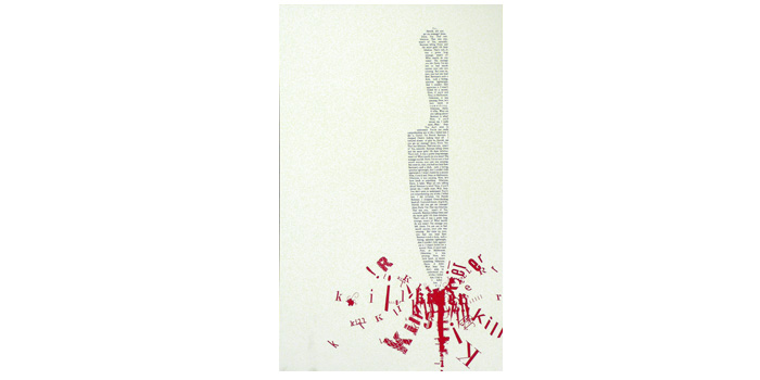
Dialog set to type
Shaped and fractured letterforms convey the gist of this dialog immediately.
• • • • •
13
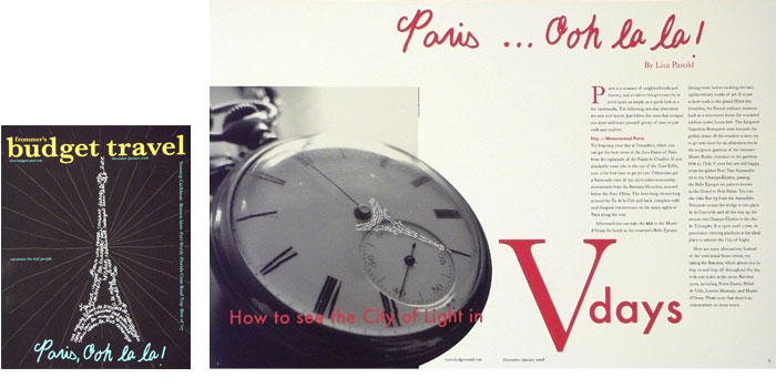
Publication Design
Danielle Gallegos
Hypothetical magazine redesign
Using information from Type + Image and Typography classes, students study common publication formats such as the magazine and annual report.
• • • • •
14
Type + Image
Ron Rocha
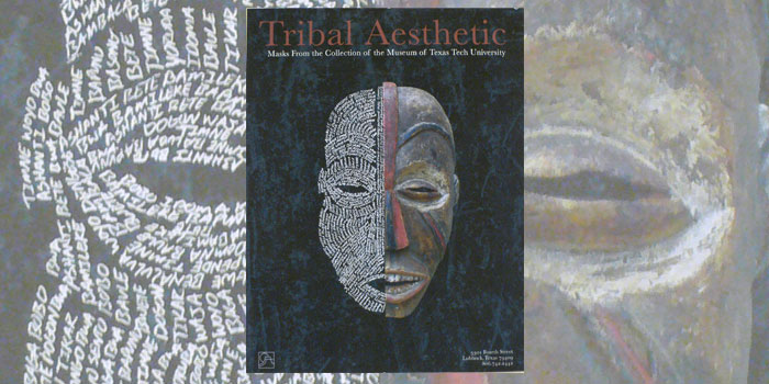
Museum collection poster
A practical application of things learned in experimental exercises.
• • • • •
15
Publication Design
Jo Skillman
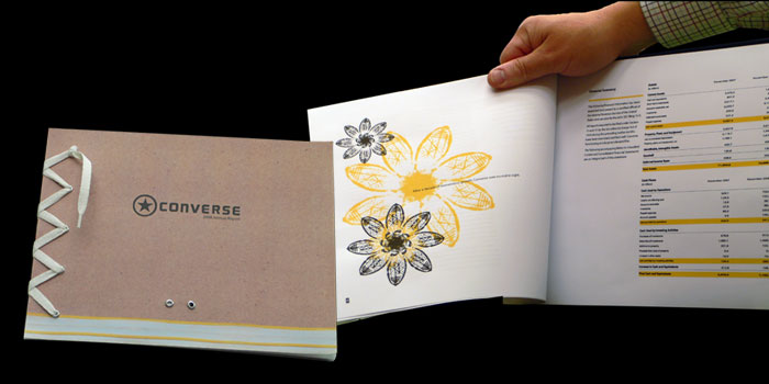
Hypothetical annual report
Audience, corporate culture, and information graphics are studied in this project. Here the designer used shoe tread prints to create exuberant flowers.
• • • • •
16
Publication Design
Zach Saathoff
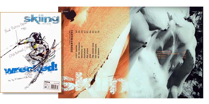
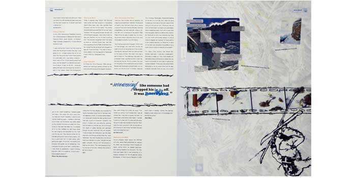
Hypothetical Magazine redesign
A cover, table of contents, editorial spread and text treatment are required in this project.
• • • • •
17
Typography
Rachel Lewis, Student Work 18
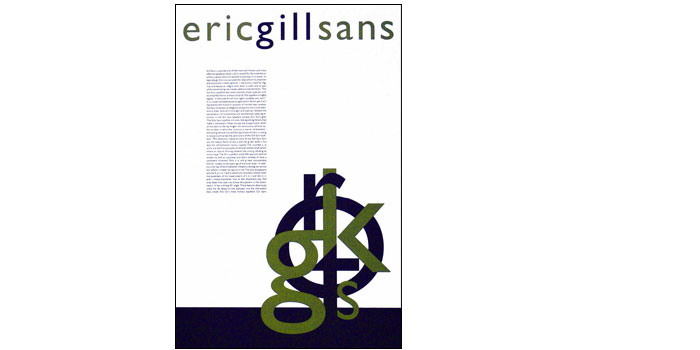
Type Designer Poster
In this class students learn to letterspace correctly, create text with even color and proper justification (or rag). The class is partly history, each student studies a single type designer in depth, then uses everything they have learned to design a biographical poster.
• • • • •
18
Typography
Various Students
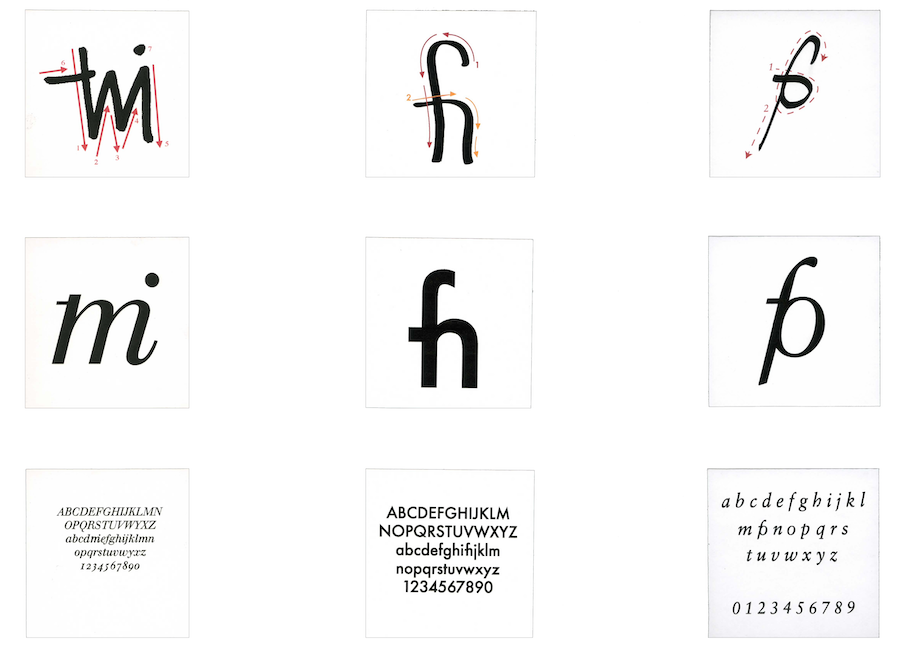
Here, the students developed a hypothetical 27th letter of the alphabet after studying ligatures, ductus (stroke order) and typographic historical details, based on common acronyms like TMI, FYI, FPO. They were then embedded in the font. Can you see them immediately?
• • • • •
19
Packaging Design
Lacy Bosze
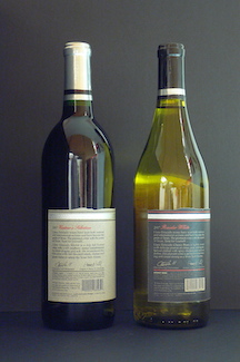
Elective classes I have taught include Packaging and Book Design. In a series of field trips for Packaging Design, the students visited Dairies and Vineyards, making proposals for labelling and packaging.
• • • • •
20
Book Design
Julie Keller
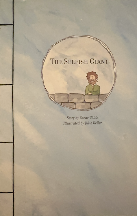
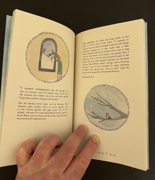
In Book Design (an elective course) students learned Perfect, Sewn, and Japanese bindings. They selected a short text (and sometimes illustrated as shown here!) then produced a complete hand-bound book.
!
