• • • • •
1
Sowell Family Collection Brochure
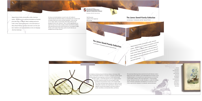
This is a gate-fold brochure for the Sowell Family Collection of natural history writers, Texas Tech University. Using varnish, metallic silver ink and a cloudscape panorama (stitched together digitally) my goal was to create a long landscape that opens to an introspective interior. This work won an Award of Excellence from the University and College Designers Association and was displayed in Toronto. It also won the American Library Association Best of Show competition in the Services Available/Orientation Materials/Policy Materials category, and was displayed in San Diego.
• • • • •
2
¿Y QUÉ? Exhibition Catalog
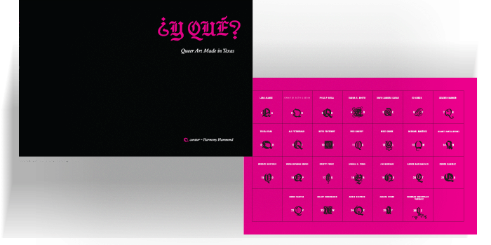
The title of this exhibition of Texas Artists translates to ‘So What?’
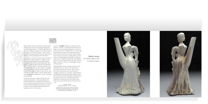
An identity for the show was made of a Gothic or black letter font and reproduced in process magenta. Letterforms like this are often used in tattoos, show up frequently in Mexico and Latin America and seemed appropriate for the Spanish title. On each page spread, the text and other visual elements were used to make conceptual spreads. On one spread, the provocative teapots by Wesley Harvey were given a textural parallel in the copy and typographic details of the accompanying text (which create the silhouette of a teapot). This publication won an Award of Excellence from the University and College Design Association and was exhibited in Savannah.
• • • • •
3
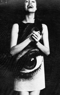
Gloria Steinem (TTU) Poster
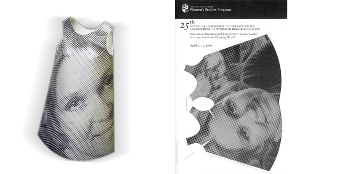
Inspired by the paper dresses of the late 1960s, this poster could be cut and folded to make an A-line dress. Below: a paper dress by designer Harry Gordon, ca. 1969.
• • • • •
4
Yale Annual Report Cover
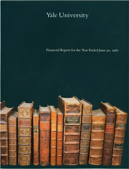
This cover to an annual report with its bookshelf became the visual metaphor for the first Yale University Web presence in 1993—94. By clicking on the spines of the books (from the 18th century seed collection to the Yale Library) the user could navigate the early site.

From “Spinning the Web: The Design of Yale’s Front Door” by Robert Callum, Electronic Publications Specialist for Academic Computing Services, Yale University. 1996:
“Frank Tierney, a graphic designer from Yale University Printing and Graphic Services created ‘the books.’ The image was based on a portion of Elihu Yale’s library, part of his original gift to the University. The different sizes and shapes of the original eleven books conspired to form a stunning graphic milieu, not unlike the ‘Manhattan Skyline,’ in the words of Paul Mellon Professor of History of Art, Jules Prown. A distinctive identifier for Yale, ‘the books’ were unlike anything then available on the Web. While ‘the books’ earned raves from the Internet community, they were subject to intense controversy among students, staff, and alumni. The image was ‘humanity centric,’ ‘scientifically bankrupt’ and ‘failed to show the beauty of New Haven.’ One perturbed alumnus asked why we could not ‘…have a nice view of the Charles River, like Harvard.’ He failed to provide relocation funds with his critique.”
Ultimately, history was rearranged, and this page was stripped of its claim to being Yale’s first homepage. Embarrassment?
• • • • •
5
More than Muñecas (More than Dolls)
Poster for lecture on Mexico as Portrayed in Paper Dolls 1920 –1970.
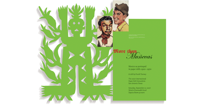
A pre-colonial tradition of paper-making exists in Mexico. Among the Sierra Otomí, shamanistic amate paper cutting is still practiced and is perhaps the inspiration behind papel picado, or pierced tissue-paper popular during the dia de los muertos. In this poster details from two vintage paper cut out dolls of the actor Cantinflas and a laser-cut facsimile of a contemporary indigenous paper figure were used to convey the wide range of dolls of or about Mexico.
• • • • •
6
Thomas Eakins Rediscovered
Exhibition Catalog
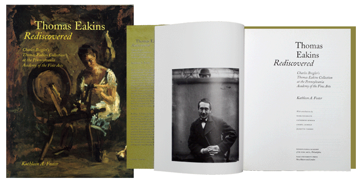
I have designed several exhibition catalogs. When specifying type and layout it is hard to avoid reading at least some of the text. From this project I learned that Philadelphia’s own Thomas Eakins used a camera to ‘draw.’ He kept that a secret, though artists have been using the camera obscura for centuries. Reassured by this knowledge I continue to use the digital camera in my own painting. This catalog accompanied a show of the same name at the Philadelphia Museum of Art.
• • • • •
7
The Grosvenor Gallery
Exhibition Catalog
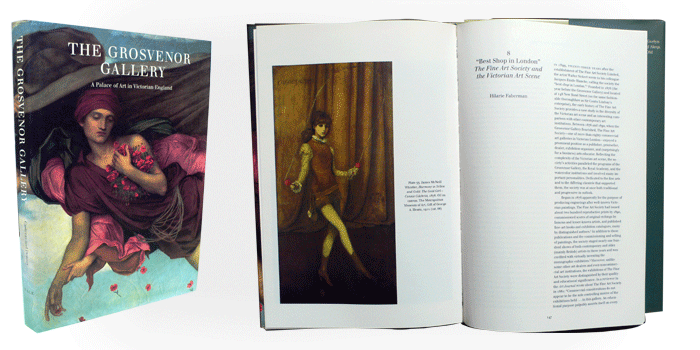
Book design has its own challenges, but the book’s well-developed system of navigation, tactility, and superior resolution still make it one of the most efficient and pleasing mediums for text and image. This catalog accompanied an exhibit on a Victorian gallery at the Yale Center for British Art.
• • • • •
8
Uncanny Spectacle
John Singer Sargent Exhibition Catalog
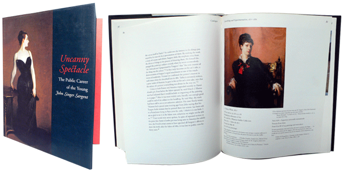
This is the catalog for an exhibition of Sargent paintings at the Sterling and Francine Clark Art Institute in Williamstown, Massachusetts.
• • • • •
9
J.Paul Getty Museum Permanent Collection Poster
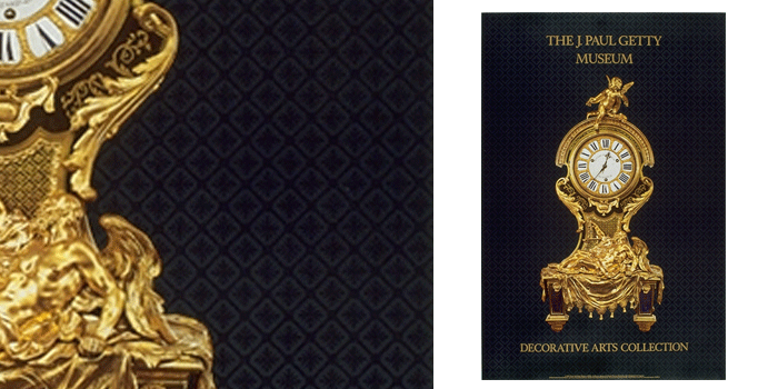
This poster for a permanent collection at the Getty Museum uses varnish on the background to reflect the elaborate Baroque marquetry of the clock case. Surface effects like varnishes, metallic inks or textured papers are still the domain of print. The intrinsically flat screen cannot come close to their physical impression.
• • • • •
10
Poster for Visiting Lecturer
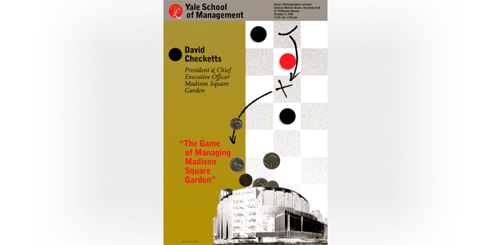
One in a series of posters designed for visiting lecturers at the Yale School of Management. The checker board was a pun on the speaker’s name; his game and goal was getting money into Madison Square Garden.
• • • • •
11
University Viewbook

This viewbook for New Mexico Highlands University had a die-cut on the cover making the boca of the guitar an entrance to the microcosm of the University. At the time, NMHU had a highly regarded mariachi band. As graphic designer there, I attempted to apply a systematic use of imagery, palette and typography throughout all publications regardless of their media.
• • • • •
12
Beyond Print poster/catalog
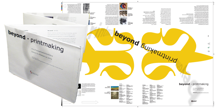
Printed using soy inks on a recycled stock, this poster folds to an accordion-fold catalog. Untrimmed, the color bars, crop marks etc. were left on the piece. The low waste and dual-purpose earned this a Gold award in the green production category of the University and College Design Association’s annual awards in Seattle. It also won an award of excellence from the New Mexico chapter of the AIGA and was displayed in Santa Fe.
• • • • •
13
Concert Poster
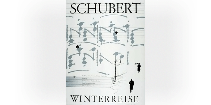
This serigraph uses metallic silver ink to evoke the wanderlust of the Schubert song cycle.
• • • • •
14
Magnet Middle School Brochure
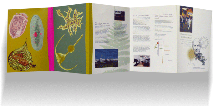
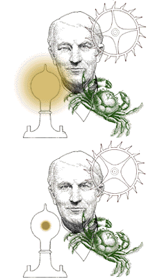
Print can be interactive. This brochure for Thomas Edison Magnet Technology Middle School in Connecticut was intended to inform parents and engage prospective students. An “amoebile” could be assembled from the die-cut protista and armatures found in the brochure.
• • • • •
15
Agfa Reproduction Camera Manual
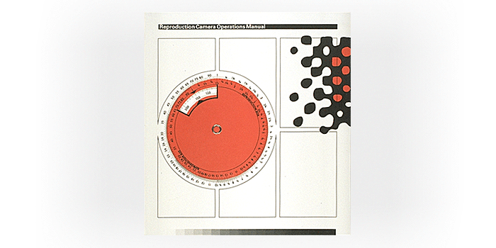
One of the great advantages of print is its potential for utilitarian interactivity. This stat camera manual had a useful proportion wheel, gray scale, and ruler on its cover. Like other designers my age, I began manipulating images and creating halftones using large upright copy cameras. In retrospect, the enlarged halftone points to the bitmap matrix of digital images.
• • • • •
16
Graduate Student Exhibition Brochure
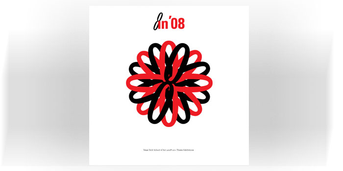
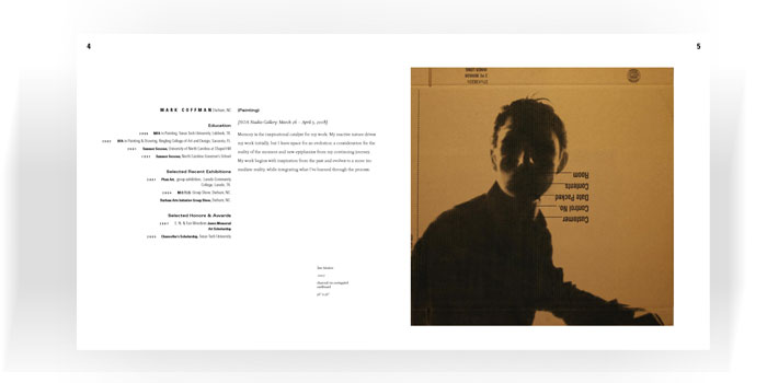
• • • • •
17
Poster for visiting performance artist Tim Miller
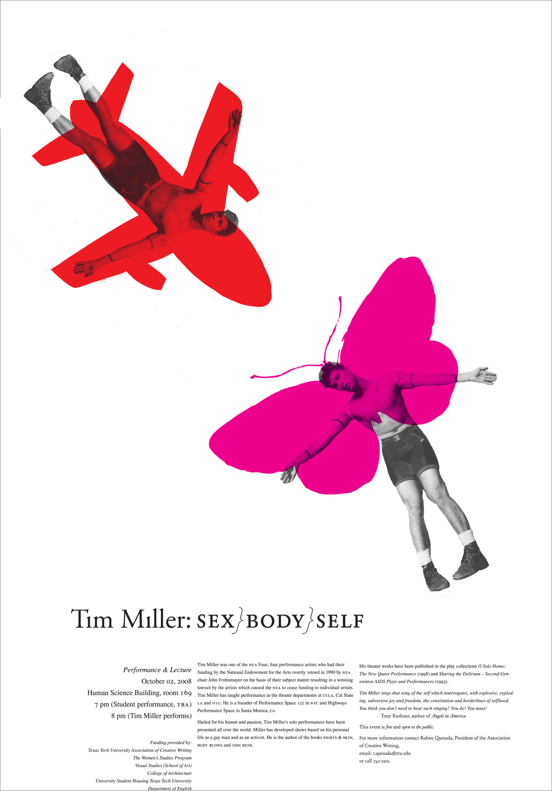
One of the NEA artists censured in the early 1990s, Tim Miller performed at Texas Tech. This poster won an award of excellence from the University and College Design Association, and was also featured in the AIGA (American Institute of Graphic Art, New Mexico chapter) First Annual Showdown at the Cowgirl Hall of Fame in Santa Fe.
• • • • •
18
A poster for natural history writer Rick Bass
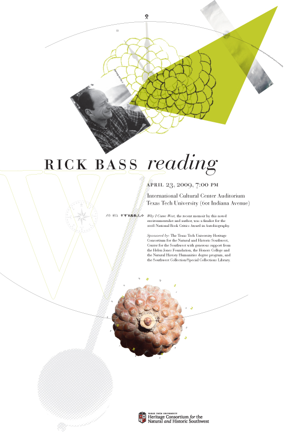
The Eleventh Hour, Hurricane Katrina, a pine cone and the Fibonacci Series. Is the pendulum swinging wildly?
• • • • •
19
Catalog/checklist
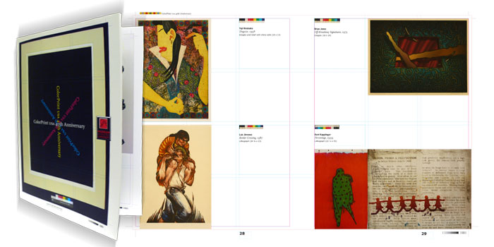
ColorPrint is a 40+ year-old national exhibition of printmaking that celebrated a significant anniversary. This catalog was designed to minimize paper waste (trim), and maximize reproduction size. To reflect the title of the exhibit, the color bars on the photo transparencies were placed next to the prints as a kind of color “fingerprint” unique to each reproduction. Crop marks, grid lines, and marks left by the software InDesign such as guidelines (in short, all the things which are usually invisible in a trimmed and completed publication) were left as a self-reference to the offset printing process. This piece was selected for the Second Annual AIGA New Mexico Showdown and displayed in Santa Fe.
• • • • •
20
Exhibition Catalog
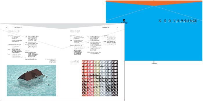
Cover and interior spread of a catalog on contemporary Korean printmaking. It was printed in Korea, and required knowledge of different paper standards, file formats and binding tolerances.
• • • • •
21
Dust jacket for Indigenous Albuquerque.
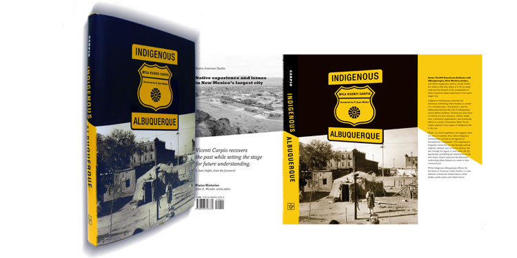
!
